Wow, a misleading chart! by jgn on Thursday, September 2, 2010 in Annoyance
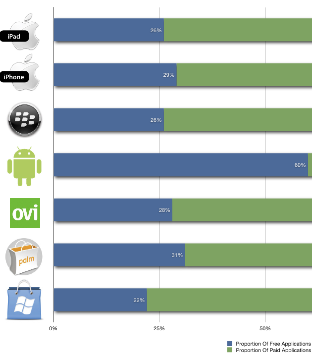
You'd think that in this era that is so much more aware of the perils of presenting misleading charts, you wouldn't see one that has the 50% mark at other than half-way across the display. But here it is:
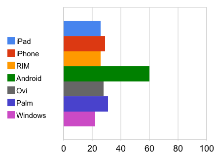
Would it have been so hard to have the width indicate the entire market? To be sure, mine should indicate in the chart that the numbers represent % of marketplace, but at least you get a feel for what "60%" really means. And it's too bad that I can't seem to get Google App's's charting to have the tick marks at intervals of 10. Still . . .

